Instagram has evolved from photo sharing to a place where brands, businesses, and influencers captivate their audience with a series of carefully planned posts. These series of well-planned posts are often referred to as an Instagram motif or theme. If you are familiar with visual layouts creating a compelling Instagram motif will be a walk in the park. However, for most of us, creating a professionally themed IG account requires a bit more planning. In this post, I’ll discuss the sequence we use to design professional Instagram motifs. These steps include:
- What is an Instagram Motif?
- Creative Instagram Motif Research
- Instagram Layout Tools
- Outsourcing Tips
Since we have a great deal of ground to cover, let’s dive in now.
What is an Instagram Motif?
Generally, a motif is a recognizable pattern or central theme. You’ll often see motifs in musical compositions. For example, The First Movement of Beethoven’s Symphony No. 5. is a music motif which is a melody that appears repeatedly in a composition. They appear either the same or slightly altered. This is synonymous with an Instagram motif. For example, you might choose to create a post template. Then whenever creating a new post image the template is altered slightly.
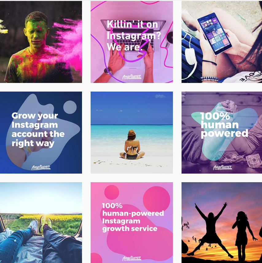
For example, our Instagram uses an alternating images and text pattern. For text posts, we use several different templates. When we create a post we modify the templates by changing the background image , text , and color. However, the overall structure will remain the same.
It takes a bit of brainstorming and polishing to get to this end result. But no worries, we’ll walk you through it.
Creative Instagram Motif Research
Whenever we begin any process whether writing an article or growing a client’s account we always start with research. Research arms you with information like current trends in your industry, industry standards, and also gives you great ideas. If you skip this step you’ll find yourself repeating tasks unnecessarily. Fortunately, creative research is much more fun than regular old research. Here’s what you’ll need to do.
- Identify 10 high-quality Instagram accounts in your industry or niche.
- Take a few minutes to observe each feed.
- Do you notice a pattern in the feed?
- Do the accounts use specific filters throughout each post?
- Do you notice similar fonts or post layouts?
- Do the accounts use colors that represent their brand?
- After observing these feeds document the following:
- Similarities across all accounts
- Specific images or layouts you liked most
- Whether or not the pattern is subtle or bold
Brainstorming Process
After conducting creative research you’ll be well on your way to creating a stellar IG motif. At this point you can decide on the central components of your Instagram motif. Some examples include:
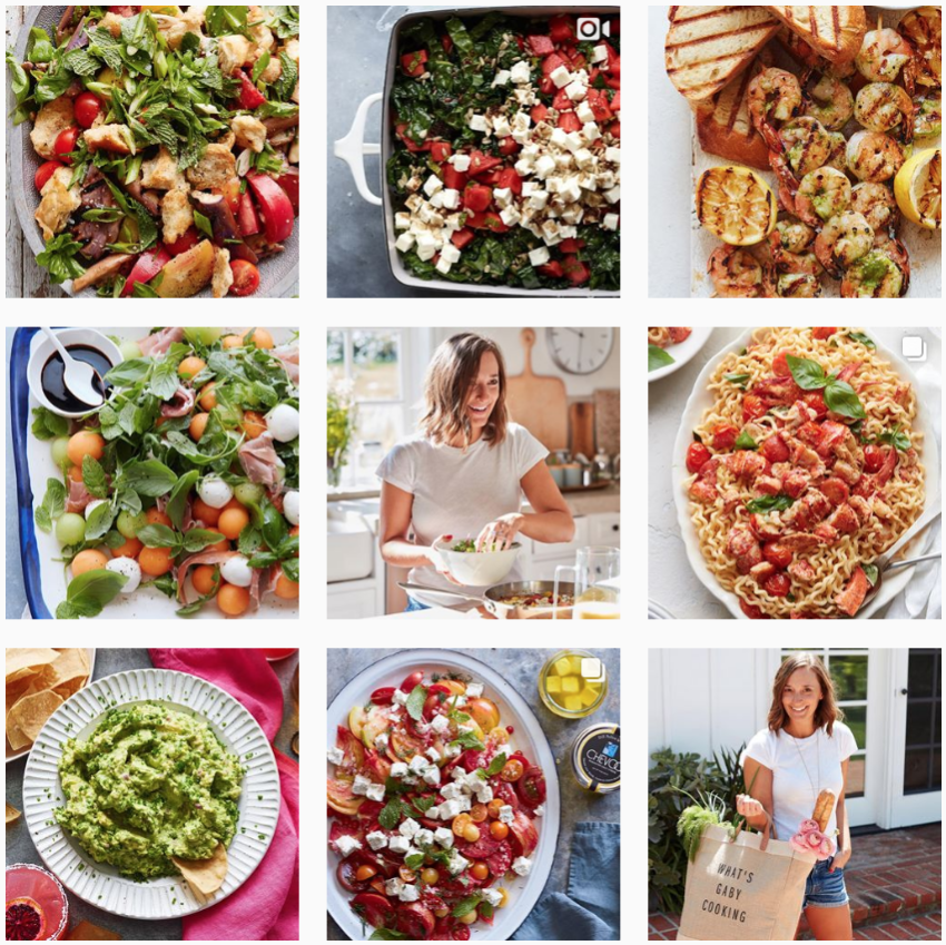
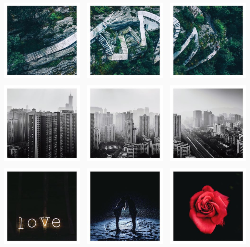
Filtered Theme (Monochrome , Grey , Color Block , or Vibrant Food Filters)
@WhatsGabyCookin uses a vibrant food filter theme with over the top images.
Bordered Theme
@TeamWoodNote uses a white-bordered Instagram Motif with alternating landscape and portrait orientations.
Horizontal or Vertical Grid Motif
@William.Wanderlust uses a horizontal grid motif.
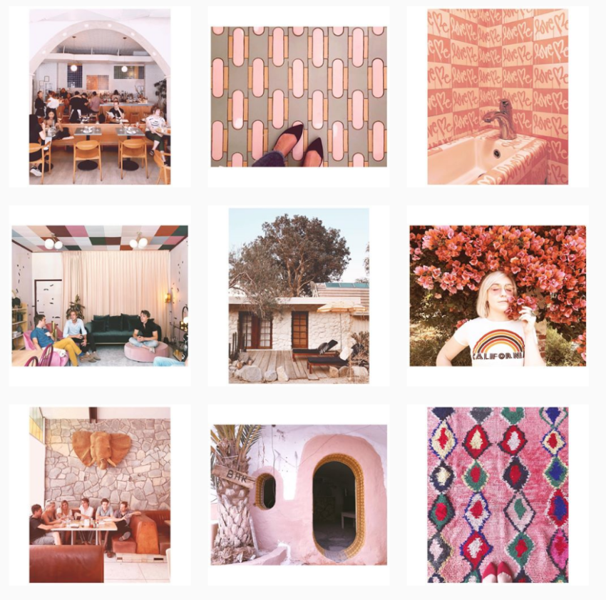
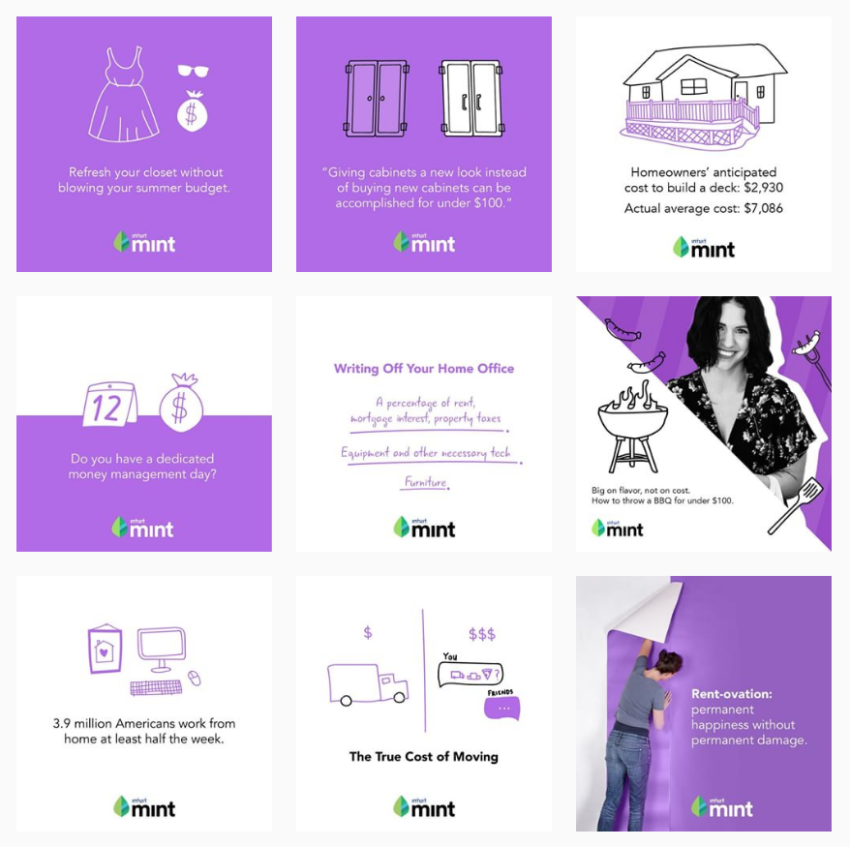
Alternating Color-Coordinated
@MintApp uses a color-coordinated Instagram Motif with unique hand-drawn iconography.
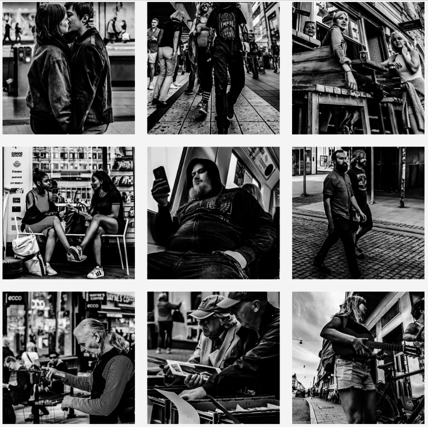
It’s important to understand that deciding exactly what pictures or templates you should use is purely a matter of preference. For example, in some cases, you may want to supplement images taken by you with royalty free images. In other cases, you may want to use templates. Depending on your creative style you may not need to use a template. For example, @mikebackstreet uses black and white photos throughout his feed. In this example, instead of using a post template to showcase a cohesive pattern.
The point is motifs don’t always have to be bold in your face patterns. They can also be subtle yet still provide a cohesive professional look. The overall goal of this process is to discover central themes that are appealing to you or your brand. Then take this inspiration and produce content of your own. Once this step is complete you can begin designing your Instagram motif using your favorite design tools.
Tip: If you are business or brand be sure to consider your design guidelines like brand colors , logo(s) , and font type. This aids in creating a more cohesive online presence.
Instagram Layout Tools
After creating visually appealing Instagram posts the next challenge is seeing how they will appear in your feed. Of course, you don’t want to post them all at once on Instagram (Pls. Don’t Do This). Instead, use a layout tool that allows you to preview and fine-tune your feed before posting content. Think of this as your Instagram staging. Some layout tools include:
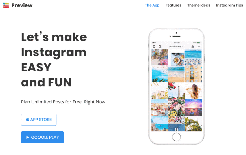
Preview App
The Preview App is available on both The App Store and Google Play. It incorporates many different Instagram features including planning, scheduling, analytics, and community.
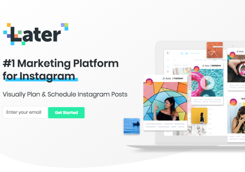
Later
Later is available on Desktop and Mobile devices. The platform incorporates interesting features including visual planning, scheduling, content library, linkin.bio, and autopublish.
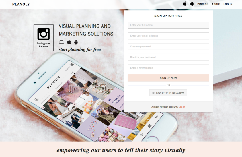
Planoly
Planoly is another visual planning and marketing tool. It’s available on Desktop and Mobile devices. The platform also incorporates different features including visual planning and scheduling.
Outsourcing Tips
The process we described above is not a run of the mill production strategy. In fact, you can employ this same process across all your content creation efforts. More importantly, the sequence makes it 100 times easier to outsource content production.
The best advice we can give is pretty actionable. Here goes:
Document this process
Additional tips that will help enhance the documentation process for outsourcing:
- Specific north star guidance on your brand identity.
- Include brand references that accurately represent branding style such as color palate and font.
- Competitor examples similar to your brand.
- Examples of what is not acceptable.
- Specific naming conventions for deliverables.
A rule of thumb when creating documentation is to answer every possible question beforehand. I have found it tends to reduce the turnaround rate and improves deliverable quality.
Final Thoughts on Instagram Motifs
Overall, creating a professional looking Instagram motif is achievable even if you’re not an expert graphic designer or photographer. Using the this concept will help to develop a cohesive feed. There’s literally nothing left to learn, so what are are you waiting for? Get out there and start creating your Instagram motif today.


11 Responses
It’s a great way to collaborate with clients and get their input before any work begins design brief example , so they can feel confident about the outcome. It’s also a great way to ensure that your creative ideas are aligned with the client’s goals and brand guidelines.
In today’s digital era, businesses require high-performance IT solutions to stay competitive. As an authorized Dell Partner in Dubai UAE TierOne provides cutting-edge Dell products and services, enabling businesses to enhance efficiency, security, and scalability. Whether you need enterprise servers, storage solutions, networking equipment, or powerful workstations, TierOne ensures seamless integration and expert support for your IT infrastructure.